Discover the population structure
Discover the population structure
When you walk around in your municipality, you can meet people of very different ages: children younger than you, children your own age, but also people the age of your parents or even your grandparents. We would like to tell you how you can view the population in various ways.

What will you learn in this topic?
Have you ever wondered how many residents your municipality has, how many children your age live in your municipality, what the most common age is, or the average age of the residents? You will discover that in this theme. And much more.
How many girls and boys in your municipality are the same age as you?
What if you compared these proportions with those in Belgium, or with the proportions you would get by doing the calculation with the students in your class? What would you find out then?
How is the age of the inhabitants distributed in your municipality?
Imagine: we gather all the inhabitants of your municipality on the playground of your school and arrange them by age. Then we count the number of inhabitants in each group and create the chart below.
We call this chart a bar chart, column chart, or bar graph (your choice), and it is used to display observations (in this case, the age of the inhabitants) according to their frequency (in this case, the number of inhabitants).
The taller the bar, the greater the frequency of the observation.
What is the most common age of the inhabitants of your municipality?
In a series of observations, the (absolute) frequency is the number of times a value is observed.
The observation with the highest frequency is called the mode.
Therefore, the most common age is the age that is most frequently observed, the age with the largest number of inhabitants.
What is the average age of the inhabitants of your municipality?
When we talk about the average, we usually mean the arithmetic mean.
To calculate the average age of the inhabitants of a geographical area, we need to:
1) Add up the ages of all inhabitants of that area
2) Divide this sum by the total number of inhabitants of that area.
What is the median age of the inhabitants of your municipality?
The median is the central value of a series of observations.
The median is a value that divides the statistical series into 2, so that half of the observed values are lower and half of the observations are higher. The median may be one of the values observed in the series, but not always.
In order to determine the median, you first have to understand the concept of cumulative frequency.
Compare the population in your municipality with that of another municipality or geographical area.
Have fun comparing the populations with each other. Do the charts look alike? Are the most common ages the same? And the medians?
What conclusions can you draw?
Choose another geographical area to compare.
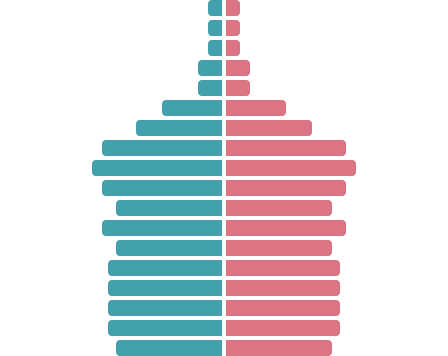
What is a population pyramid?
A population pyramid shows the distribution by gender and age of a given population at a given time.
It consists of 2 bar charts (one for each gender) with the number of inhabitants on the X-axis (horizontal axis) and the age on the Y-axis (vertical axis).
The population pyramid has the shape of a pyramid when there are many young people and few older people. You will see that this is not always the case.
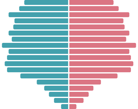
What shape can a population pyramid take?
You will see that a population pyramid does not always have the shape of a pyramid. It can look like a bell jar, a mushroom, a spinning top, a tower, an urn or other shapes.
Diamond
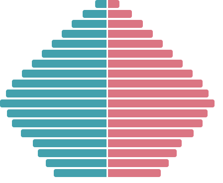
This pyramid shows a marked concentration of people in one or more specific age groups. The further you move away from these central groups, the more the number of people in the age groups decreases.
Compare the population pyramid of your municipality with that of another geographical area.
Your journey through the different municipalities of Belgium will undoubtedly make you discover other shapes.
This kind of chart allows us to compare populations with each other, but also to observe the effects of some historical facts on the population and to determine a trend on which politicians can base their decisions.
Choose another geographical area to compare:
And what about population density?
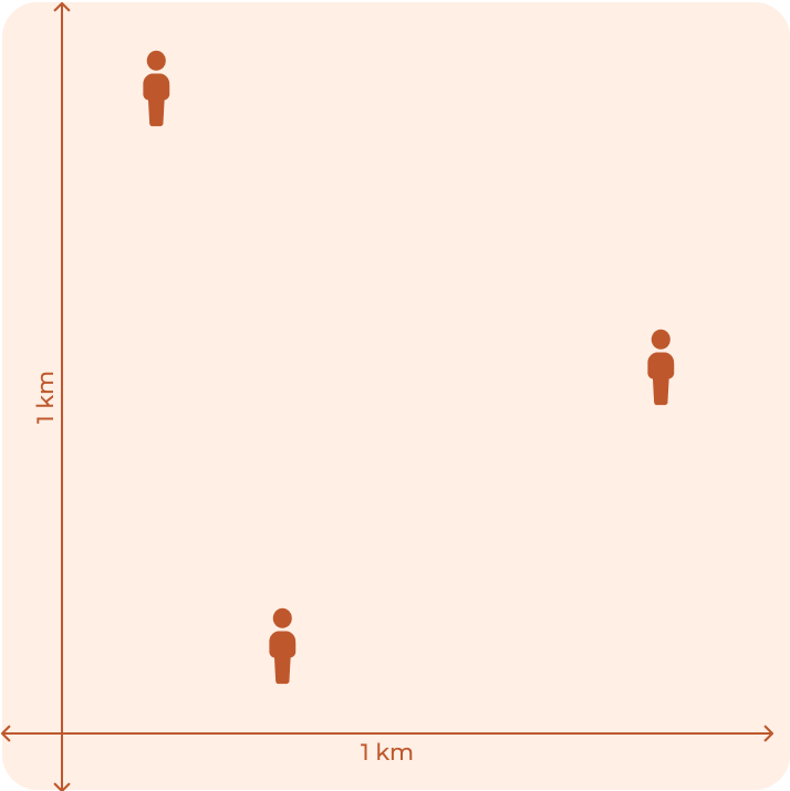
Population density is a measure of the number of residents in a certain area, usually 1 km². Density is not the same everywhere. Some places on earth are more densely populated than others per km².
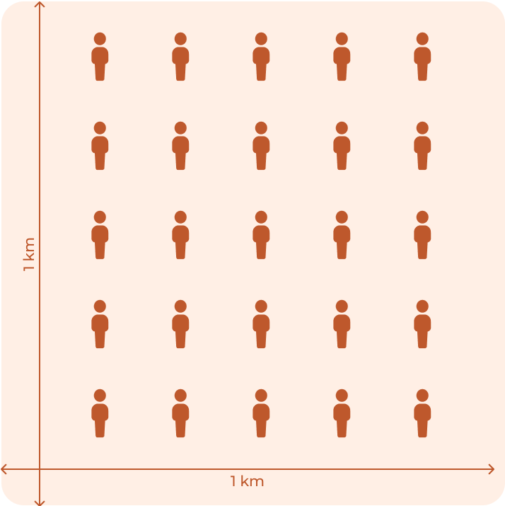
Low population density
Compare the population density of your municipality with that of another municipality.
You will see that in Belgium, population density is not the same everywhere. Some municipalities are more densely populated than others.
Do you find this website instructive?
Want to test your knowledge about the topic Population?
Or read the next topic 'Population evolution'
Statbel
North Gate
Boulevard du Roi Albert II, 16
1000 Bruxelles
FPS Economy, SMEs, Self-Employed and Energy / ©2024 Statbel